Re:dash is an open source data collaboration and visualisation tool that allows you to share dashboards across your business. Designed because of the bloated other tools that data teams had to use when connecting to Redshift.
We’ve trailed the open-source version (release of late 2016: 0.12) and you can see what I think about the tool in the review below.
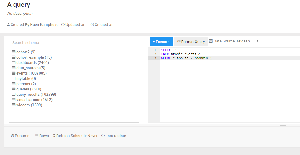
SQL Editor
One of the great things from re:dash is the editor. It’s very simple to change the data source and format the query, it has all the default options you expect from an editor. What makes the editor stand out for me is the schema/table selector on the left side and the default table that shows after a query.
Who remembers all the columns and tables in the database? I certainly do not.. so it’s very handy to have them all on the left side.
It has auto query selection but it doesn’t work well: if you have more then 5000 columns (which in a data warehouse isn’t even that much) it’s turned off by default. The auto query selection is especially useful with lots of columns which makes it annoying that its not available with lots of columns.
The editor also doesn’t work with short names for schema’s in Redshift/Postgres. E.g. writing “atomic.events e” and then “e.do..” won’t show the correct pre-selected field.
Connections
Re:dash has lots of possible connections. The most up-to-date list can be found on the Re:dash connection page. We’ve been using the Redshift, Google Spreadsheet and the JIRA connection. All of them are easy to set-up and do what they are supposed to do.
Biggest issue is that a connection can’t be tested. After putting in all the connection details it saves the connection but no way to test if it’s actually working.
Re:dash Charts and dashboards
Re:dash has lots of charts available and more are added every now and then. You got all the standard like a bar, line and pie chart. On top of that you got some that can be very useful if certain situations.
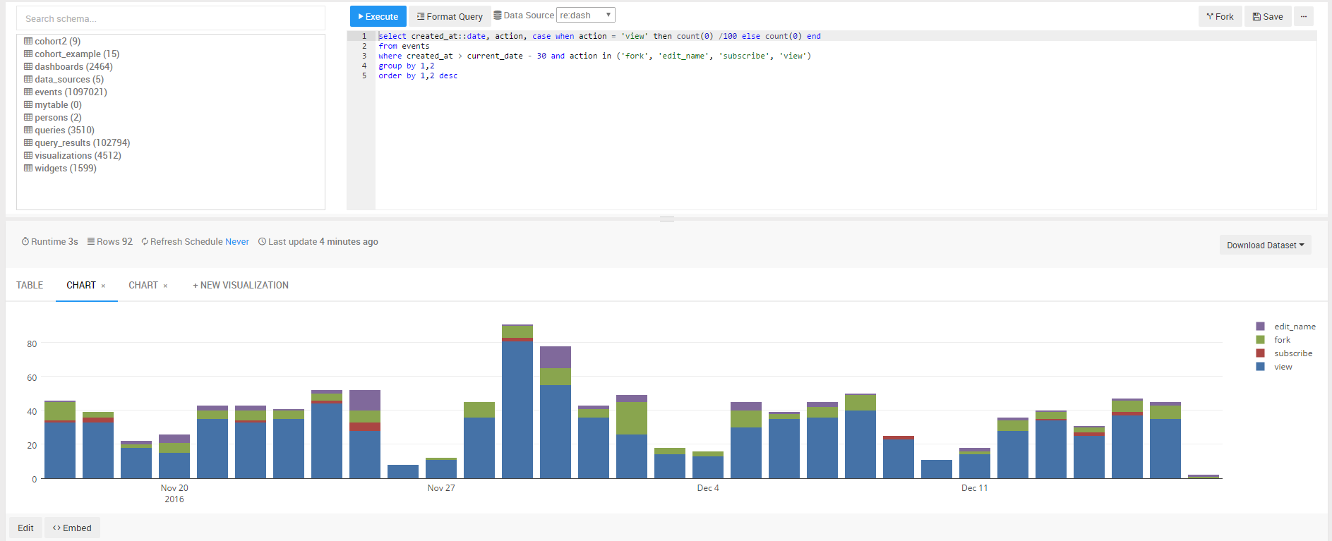
The sankey, sunburst, cohort and map all come in handy when creating dashboards for projects. You just need to make sure you serve the data in a specific way.
As an example, we wanted to see the influence of weather in Australia on our conversions, and if users stick around longer with certain weather events. This was a long shot but re:dash did give us to opportunity to fully show what we wanted.
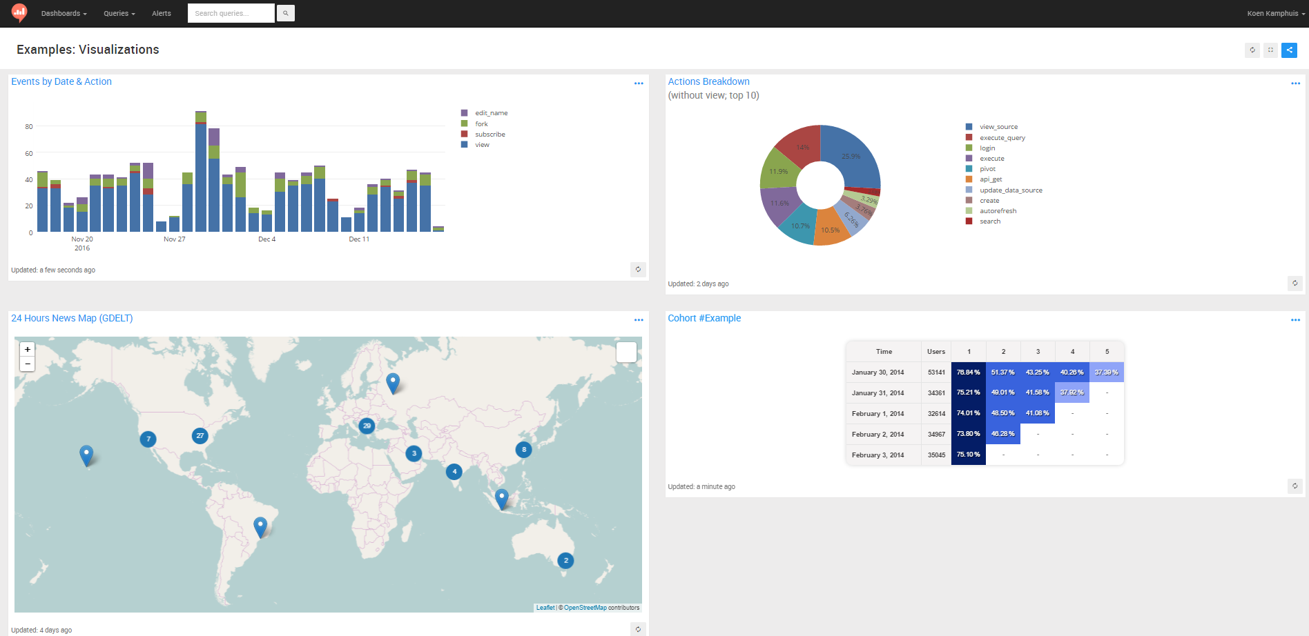
Pie, map and cohort.
Sharing dashboards is easy enough, just create a dashboard and share a link. It is annoying you can’t customise a dashboard to show a visualisation in a specific place. This is done automatically.
Another little quirky thing is that you can embed a visualisation with an iframe, everyone can see it, even without a login. But you can’t do the same with a dashboard.
Costs
Not sure about the pricing but we used the open-source version. The open-source function is still in development (currently the 0.12 version just got released) but the latest version is very stable and does all the things you want.
Releases are quite slow. The next release is supposed to be a full 1.00 release but looking at the previous deployments I wouldn’t expect this any time soon.
Re:dash overall look and feel
It might not be the best designed analysis tool ever but it certainly isn’t the worst, it lacks the polish of a Mode Analytics but it’s better then an Apache Zepplin.
The fonts, colours and charts all look good. It could use some “pop” (lack of a better word) like some drag-and-drop for the dashboards and some consistencies in the font sizes and upper/lowercase.
Python and more..
From what I can see there is no way to run Python code itself but that is not really the tool it’s mend to be. Although other tools like Mode Analytics and Apache Zeppelin do have those possibilities.
A future feature perhaps?
TLDR; and the end bit..
Personally, I think Re:dash can be one of the best open-source tools around. It has all the ingredients to become a household name in the industry and some bigger companies are already using it on a daily base although not as the only tool in your analytics stack.
Like mentioned before, it lacks a bit of polish on the look and feel, and some tweaks that can be made in the dashboard environment. It does feel like it the closest tool that mimics my all time favourite Wagon and with more released coming up it can only get better.
0 Comments
1 Pingback